Design Thinking for a Smooth Booking Experience
Imagine the inefficiencies of managing appointments across multiple clinic websites. That was the reality for Harley Hospital. This use case showcases my role in collaborating with Creative Navy to design a mobile app that streamlines the booking process, transforming frustration into a 'booked!' moment within minutes.
Background
Inefficient bookings plagued Harley Hospital. Patients at this growing UK private clinic network struggled with separate clinics’ websites, hindering specialist searches and quick appointments.
To address this challenge, through the King's UX Design Career Accelerator program, I had the valuable opportunity to collaborate with Creative Navy, a London-based UX/UI design agency. While the design itself was solely executed by my team, Creative Navy provided invaluable feedback throughout the process.
Together, we designed a mobile app that streamlines the hospital appointment booking process for patients. The app simplifies patient scheduling by offering:
- Effortless Search: Find appointments based on your needs (specialty, location, doctor).
- Real-Time Availability: See up-to-date appointment slots at a glance.
- Fast Booking: Confirm bookings within a minute, eliminating wait times.
Benefits for Hospitals:
- Centralised Appointments: Manage all network appointments in one system, improving efficiency.
- Enhanced Accessibility: Offer patients a convenient and user-friendly booking experience.
This collaborative effort aimed to improve the booking experience for both patients and hospital staff.
Understanding User Needs and Challenges
Our research; encompassing client data, usability testing, competitor analysis, and existing research reviews, revealed critical user frustrations with existing booking systems. These included:
- Limited accessibility: Difficulty finding appointments with desired specialists and coverage areas.
- Unclear appointment details: Confusion surrounding out-of-clinic contact options and unclear appointment durations.
- Misleading cost information: Difficulty understanding true appointment costs.
- Technical glitches: System bugs and crashes hindering the booking process.
- Booking limitations & confusing processes: Accessibility issues for non-tech-savvy users, and lengthy, confusing workflows.
This comprehensive analysis not only validated our initial concerns but also shed light on additional user pain points, all of which contributed to overall user frustration and booking inefficiency.
This resulted in the following user problem statement:
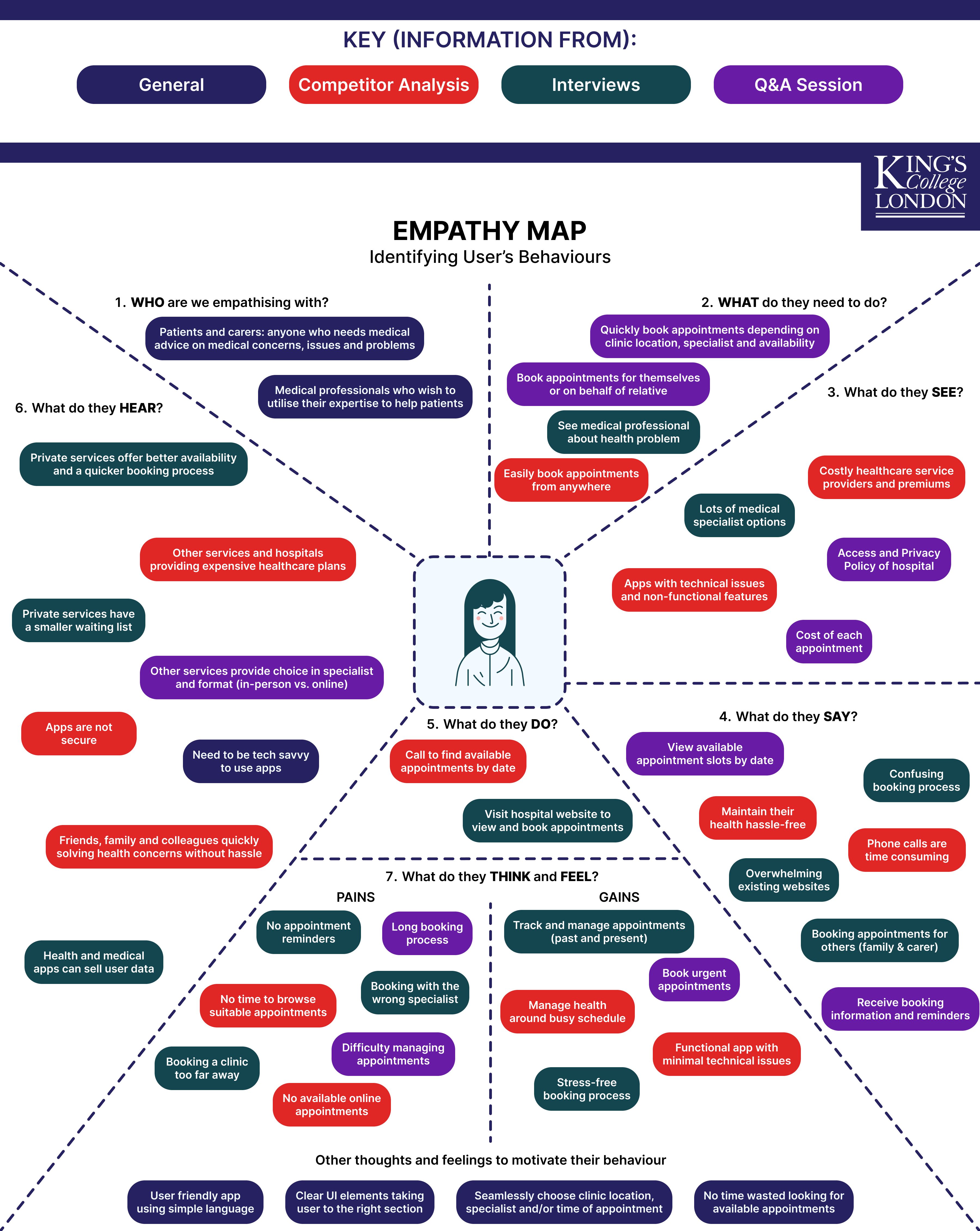
Unlocking User Motivations Through Empathy Maps
Leveraging the research findings, we created an empathy map to delve into user thoughts, feelings, and needs. This visual tool revealed key areas for improvement:
- Clear UI elements Users crave a user interface that's intuitive and easy to navigate.
- Streamlined booking process The booking flow needs to be efficient and minimise complexity.
- Out-of-app functionalities Reminders and notifications outside the app would enhance user convenience.
By prioritising these insights, we aimed to design an app that empowers users to directly book appointments. This user-centred approach prioritises addressing user needs, minimising stress, and providing a more accessible option for all.
Designing a User-Friendly Booking Flow
To jumpstart the solution-finding process, I led an ideation workshop where we explored various concepts for a streamlined and user-friendly booking system using Crazy 8s and SCAMPER techniques. The impact-effort matrix then helped us prioritise the most promising ideas for further development.
Main Booking Flow
Leveraging the high-impact ideas from prioritisation, we developed a user flow that maps the essential steps for booking an appointment. This flow prioritises simplicity and minimises complexity while ensuring all crucial information is collected from users at the appropriate points. The flow also provides users with clear details about the booking, including location, date, time, and any other relevant information. This transparency ensures users understand all aspects of their appointment before confirming it.

Additionally, recognizing that some users might be unsure about which specific service to book, we incorporated a consultation alternative flow. This flow allows users to clarify directly with the hospital what is the most suitable service for their needs.

Reschedule/Cancel Flow
We understand that schedules can change. To address this, we've implemented a dedicated user flow for rescheduling appointments within the app. This streamlined process makes it quick and easy for users to modify their appointment times.
We also designed a dedicated user flow for cancelling appointments. This allows users to conveniently cancel their appointments directly through the app with minimal effort, enhancing the overall user experience.

Rebooking Flow
To further enhance user convenience, a dedicated rebooking flow was developed. This flow caters specifically to scheduling follow-up appointments. By utilising this flow, users can seamlessly book follow-up appointments without going through the entire booking process again.
User Testing the Booking Flow Prototype
To ensure the app offered a seamless and user-centric experience, we conducted a series of usability testing sessions. During these sessions, participants completed a variety of tasks that reflect real-world usage, such as booking appointments, rescheduling, managing follow-ups, and exploring online consultations. By closely observing user behaviour and gathering their feedback, we aimed to identify any pain points or opportunities to enhance the app's design and functionality. The user testing findings included:
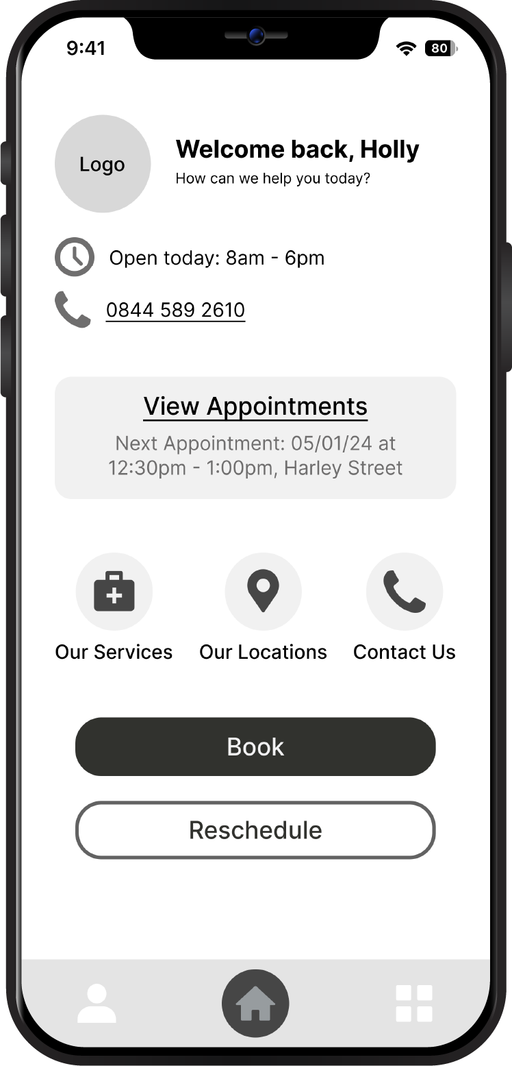
Clarity and Content - Main Screen
Users found the main screen layout to be simple and informative, providing them with the most important details readily available. However, the presence of two phone icons in close proximity caused confusion.
- Solution: To address this, we can remove the direct contact information from the home screen and relocate it to dedicated sections like 'Contact Us' and 'Our Services' for easy access when needed.
Positive User Experience - Booking/Reschedule/Cancel Flows
Users consistently praised the clarity and ease of use for the appointment booking process. They appreciated the clear division of reschedule times, the simplicity of cancelling appointments, and the helpful functionality of receiving detailed confirmation at the end of the booking flow.
- Action: No immediate action required. This feedback highlights positive aspects of the app.
Efficient Booking - Follow-up Appointments
Users valued the ability to easily book follow-up appointments without going through the entire booking process again. However, they expressed a desire for more information about their next appointment to be displayed directly on the home screen - ‘Is it a follow up or first appointment?’
- Solution: To enhance user experience, we can integrate more details (follow-up or first visit, assigned specialist, and clinic location) about the next appointment into the home screen, providing a more comprehensive overview for users.
Convenient Feature - Online Consultations
Users appreciated the availability of an online consultation within the app, eliminating the need for phone calls to the hospital for inquiries. However, some users found the access point for this to be small and difficult to locate. Additionally, users felt the app lacked information regarding the status of their consultation requests.
- Solution: We can address these issues by adding another option to access the consultation form directly from the home screen or main menu, improving its visibility. As well as by including a dedicated section on the home screen to display the current status of users' consultation requests, enhancing transparency.
Conclusion: A Streamlined Booking Experience for Harley Hospital Patients
Our user-centred design resulted in a mobile app that can streamline appointment booking for Harley Hospital patients. This project demonstrates the power of user-centred design in creating a valuable and user-friendly solution. The Harley Hospital booking app empowers patients to manage their healthcare appointments with ease, leading to a smoother and more positive experience for everyone involved.
Key Improvements:
- Effortless booking and management through a single app.
- Clear appointment details and confirmation screens.
- Dedicated flows for rescheduling, cancelling, and rebooking.
- User-friendly interface for all technical abilities.
Benefits:
- Reduced patient frustration and increased efficiency.
- Enhanced patient satisfaction and loyalty.
- Broader accessibility to hospital services.